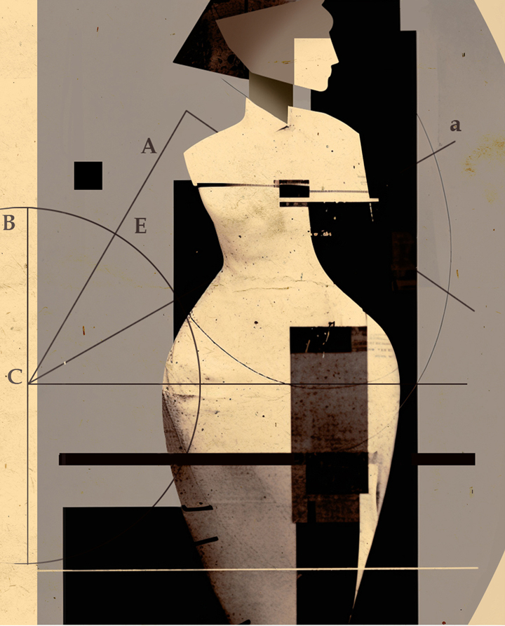
An imagined cover for a new school mathematics book.
News

I was asked by Georgetown University to produce a banner illustration to show a diversity of people, ethnicities, genders and ages. While waiting for the brief I had started to do some pen drawings of heads and envisaging a way the banner might work. The yellow version here is an option but as it turns out the requirements called for a high level of realism - more of a photo/collage look.

These rough line scamps were intended to show the layout. Larger heads in front, receding in size with rows of people behind.

These were three alternatives of which the all-blue version was the preferred option.
Full page image and spot for Scientific American Mind.
An image was required to depict how we learn when no one is teaching us - how we make mental maps, how we learn languages, how we come to understand how things work.
Initial thoughts centred around virtual reality and headsets which were referenced in the copy. It was felt that approach made it too specific to a certain approach for simulating the process but didn't get really get across the main idea. Stripping away the tech and making more of a cityscape backdrop was a much better fit and it was that concept that was carried through to finished art.

The spot illustration focused more on how we unconsciously learn from each other.

A quick turnaround was needed for this job from The Financial Times. The story was about a summer school for would-be MBA graduates. A two-week residency, promising to deliver “a unique and transformative experience” at its campus amid the forest of Fontainebleau, on the southern outskirts of Paris. Along with classes on business awareness there are sports, games and other more relaxing activities.
This was an illustration for the Spring edition of forward, the magazine of Iowa State University Foundation.
This cover image was initially to be based on the attempts to control the outbreak of avian flu (as in first sketch above) but later became more focussed on protecting the animal food supply from the effects of the flu. To this end the editors had an image in mind they wanted to use - an ethnically varied team of scientific specialists
I supplied the second sketch above for approval before moving onto the artwork. I wanted it to look quite hard and scientific avoiding anything too soft or cartoon-like. With such a detailed image I elected to use a limited colour palette to create a unified feel.


